The original ad can be found at https://www.drpepper.com/en/dietdrpepper
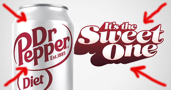
CONTRAST

The simplicity of contrast between the background the the words make your eyes go directly to the words rather than getting lost in fine print or overwhelming backgrounds.
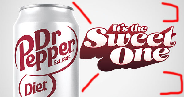
PROXIMITY

Because there is only two things in this ad, the can and the words, it is logical to put them next to each other. But your eyes automatically go to the middle of the ad because of the placement of the text and can. You also know that the text is referring to the can of soda because of the placement and lack of white space.
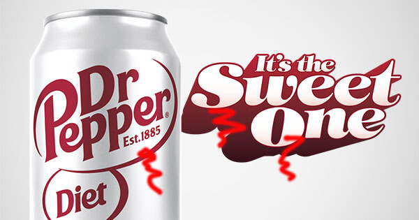
REPETITION

Repetition can be found in the font used between the can and the text. This brings unity and makes it more obvious that the text is related to the image.
ALIGNMENT

Centering the text makes it easy to tell that it is related to the image. Aligning the image to the left allows your eyes to focus on it, but not get stuck on the image where you can read the text.
COLOR

By using similar colors between the text and image brings the whole ad together as one. This makes it obvious that the text is describing the image.